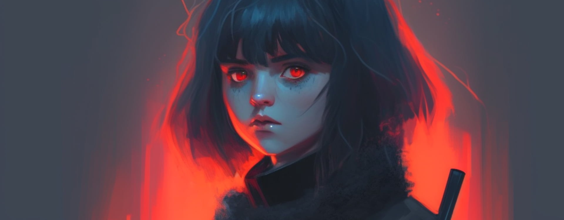
Fire sleeps behind her eyes of endless night.


The Hidden Energy of Expression
Not all stories are told aloud. Some live behind a single look — intense, unreadable, magnetic. The girl with crimson eyes is not a figure of chaos, but of control. Her silence speaks louder than a thousand words; her gaze carries an entire narrative of restraint, strength, and emotion. Communication today is no longer just about visibility — it’s about vibration. The tone of a color, the weight of an image, the pause between words — these are the new languages of emotion.
“The most powerful thing in communication is hearing what isn’t said.”
— Peter Drucker
Like fire beneath ash, emotion often hides behind composure. Brands, like people, must learn to express that subtle tension — the moment between calm and ignition — because that’s where true connection happens.
Emotion as the Core of Modern Communication
The red and grey palette of this image creates a visual metaphor for intensity restrained by elegance. Grey symbolizes composure and neutrality; red introduces pulse, passion, and purpose. Together, they represent the balance every communicator seeks — reason guided by feeling.
The Power of Controlled Intensity
Effective communication isn’t constant energy; it’s rhythm. Like fire, it breathes, grows, and pauses. Knowing when to burn bright — and when to stay still — defines a message’s strength. In creative communication, restraint is as impactful as expression. The right silence, the right shade, the right moment — these choices give language its power. Used strategically, controlled intensity helps brands:
- Convey depth and confidence instead of noise.
- Build mystery and curiosity that drive engagement.
- Project emotional intelligence through tone and imagery.
- Establish trust by allowing space for interpretation.
Color as a Language of Emotion
Red has always symbolized desire, courage, and transformation. In communication design, it commands attention but also carries vulnerability — it’s both danger and desire, action and empathy. When paired with neutral tones, it creates emotional balance — inviting the viewer to look deeper rather than react instantly. Color is not decoration; it’s dialogue. Every hue holds psychological weight, and how we use it defines how people feel our message, not just how they see it.
Silence as a Strategy
In an era of constant noise, silence has become a form of power. The girl’s quiet intensity reflects what modern communication needs most — focus. Not more words, but better pauses. Not louder volume, but clearer emotion. Great communicators — whether brands or individuals — know that attention isn’t demanded, it’s earned through authenticity and restraint.
To say fire sleeps behind her eyes of endless night is to acknowledge the power of hidden energy — the spark that fuels emotion beneath calm surfaces. Communication, like art, lives in contrast: passion beneath structure, silence beside strength, color within shadow. It’s not about how much we say, but how deeply we make people feel. Because every great message carries its own quiet fire — and those who learn to speak its language never need to shout.
Other Articles
2. In the Navigator (left panel), go to "Section X" → "Wrap X" → "Video Background".
3. Select the "Vimeo Cover" component.
4. In the Properties (right panel), replace the ID in the address with the ID of your Vimeo video - they look like 1012796711.
5. When finished, exit the symbol by clicking the green button at the top.


